What Does a Live Casino Presenter Actually Contribute?
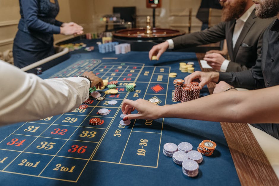
Photo credit: La Planque Du Joueur on Unsplash.
A live casino presenter can look, at first glance, like the human face placed in front of a camera while a game runs. But that understates the job. A presenter helps turn rules, turns and pauses into a watchable format. They guide attention, make the pace feel legible and give a designed environment a human point of reference.
That contribution is not simply a matter of charm or polished delivery. It depends on timing, clear communication and the way a presenter works with the set, interface, camera and game mechanics. In a crowded casino lobby, where a player may see many small previews at once, those details can also help distinguish one title from another.
To understand the role, it helps to look beyond the presenter alone. The experience is built from a whole system: the visual theme, the mobile layout, the game’s feedback and the presenter’s on-camera delivery. When those parts agree, the result feels coherent. When they compete, even a confident host can struggle to make the format clear.
More than a person on camera
In a live casino format, the presenter acts as a guide to what is happening. They may introduce a round, explain an action, acknowledge a result or help bridge the quiet moments between events. Their work sits between the game’s rules and the player’s immediate experience of those rules.
This is especially useful when a format has stages that are easy to miss. A brief verbal cue can clarify which action comes next. A pause can give viewers time to read a result. A change in energy can signal that an important moment is approaching. These choices make the sequence easier to follow without requiring the presenter to explain every detail.
The key is proportion. A presenter should support the game, not talk over it. If every moment receives the same amount of commentary, useful information becomes harder to pick out. Good presenter timing means knowing when to speak, when to leave room for the game’s own signals and when a short, clear explanation is more helpful than a long one.
Building a theme into a visual world
A theme becomes convincing when it shapes more than the background. A studio may suggest a particular setting through its colors, lighting, furniture, camera framing and on-screen graphics. The presenter then helps make that setting feel inhabited rather than decorative.
Consider the difference between a themed set and a coherent visual world. A themed set might add a few recognizable props around a standard table. A coherent world carries the idea through the whole experience: the visual language, the presenter’s tone, the pace of transitions and the design of the interface all feel as if they belong together.
The presenter is one part of that system. Their clothing, posture and style of address can fit the atmosphere without turning into a performance that distracts from the game. A playful format may call for a lighter tone; a more formal one may benefit from measured delivery. The point is not to make every presenter behave in the same way. It is to make the human presence feel consistent with the experience being presented.
This consistency also helps with format familiarity. Once viewers recognize the visual cues and the presenter’s way of guiding a round, they can spend less attention working out how the experience is organized. Familiarity does not mean that every title should look identical. It means that recurring cues—where the result appears, how a round begins or how an instruction is delivered—remain dependable enough to learn.
Theme should not obscure the rules
Strong art direction can still fail if it makes practical information difficult to see. Decorative lettering, low-contrast labels or busy backgrounds can make a game feel polished in a large studio view and confusing on a phone. A presenter can restate an instruction, but they cannot reliably compensate for an interface that hides it.
The best themes make clarity part of the design. A visual cue can carry atmosphere while still pointing to the relevant action. A distinctive set can make a title memorable without crowding the area where results appear. And a presenter can reinforce the tone while using plain language for anything that affects understanding.
Readability when the screen gets smaller
Many people encounter a live casino title on a mobile screen, sometimes in a compact lobby preview before opening it. At that size, the viewer needs to recognize the format quickly. Small labels, fine details and wide studio compositions can all lose impact once the image is reduced.
This is where design has to be tested at actual phone scale, not just admired on a large monitor. Can a viewer identify the presenter’s position in the frame? Is the active game area visible? Can the outcome or next-step information be read without squinting? Does the interface leave enough room for the game itself?
On-camera delivery matters here because speech can provide useful context when visual detail is limited. A presenter can name the next step or briefly mark a change in the round. But spoken cues are a supplement, not a replacement for legible text and clear visual hierarchy. Some viewers watch with the sound off; others may be in a noisy setting or may not be able to hear the audio clearly.
That makes accessibility a basic part of the design conversation. Instructions and important outcomes should not depend on hearing a particular phrase. On-screen text should be readable, and key changes should have visual signals as well as sound. If a presenter says that something has happened but the screen gives no clear indication, viewers watching silently may miss it.
Recognition in a crowded casino lobby
A casino lobby is a selection environment. A title may appear as a small tile, an animated preview or a thumbnail among many alternatives. The presenter can contribute to recognition, but only if the design gives the person and the game a clear visual signature.

That signature might come from a distinctive set, a consistent camera composition, a recognizable color palette or a presenter who is framed in a particular way. The goal is not to make a thumbnail tell the whole story. It is to help someone identify the format at a glance and know what sort of experience they are about to open.
Thumbnail recognition also depends on restraint. Too many moving elements can make a preview hard to parse. If the presenter, graphics and game action all compete for attention in a small tile, viewers may see motion without retaining a clear image. A single strong focal point is often more useful than a miniature version of every on-screen element.
For teams creating lobby assets, it is worth checking how a title reads in both static and motion formats. Does the presenter remain recognizable when the tile is small? Does the title still make sense if animation is paused or reduced? Can someone distinguish it from neighboring games without relying on tiny text? Those are practical tests of visual identity, not just aesthetic preferences.
Animation as feedback and attention control
Animation can show that an action has registered, indicate a transition or draw the eye to a change in state. In a live format, it also works alongside the presenter’s timing. A short visual effect can confirm what the presenter has just explained; a deliberate pause before a result can build anticipation without adding more spoken commentary.
Used well, animation answers a simple question: what changed? It might highlight an active area, mark a completed step or make a new result easy to locate. This novinite.com is feedback. It tells the viewer that the system has moved from one state to another.
Animation also controls attention. A motion cue can help direct the gaze toward the relevant part of the screen, especially when the scene contains several elements. But attention is limited. If the background, interface, presenter graphics and game elements are constantly moving, the viewer has no quiet place to look. Motion loses its meaning when everything moves at once.
Let effects support the presenter, not compete with them
Sound effects often do more feedback work than teams expect. A soft cue can confirm a selection or signal a transition. A presenter may acknowledge the same moment verbally, but the sound gives an immediate response. That can make an interaction feel more understandable—provided the visual interface communicates the change too.
For sound-off viewing, animation and text need to carry enough information on their own. For sound-on viewing, effects should be distinct without overwhelming speech. The presenter should not have to raise their voice to compete with music or repeated stings. Good coordination leaves space for each signal to do its job.
Motion also needs to be considerate. Repeated flashes or rapid transitions can be uncomfortable for some viewers. Essential information should remain available long enough to notice, and important cues should not depend on a fast animation that disappears before someone can interpret it.
What presenter timing looks like in practice
Presenter timing is not just the rhythm of speech. It is the relationship between the presenter, the game’s pace and the viewer’s opportunity to understand what is happening. The presenter’s job is to fill gaps when guidance is useful and leave space when the screen already communicates clearly.
That can mean holding a beat before a result, allowing a moment for a number or label to register, or avoiding commentary during an important visual event. It can also mean keeping explanations brief and placing them where they are most likely to help: before a new action, at a transition or when a format could otherwise be misunderstood.
In practical terms, a production team can review a round with a few questions:
- Does the presenter explain the next step before viewers need to act on the information?
- Is there enough time to read on-screen instructions or results?
- Do visual and audio cues agree with what the presenter says?
- Can the round still be followed with the sound muted?
- Are there moments when silence would make the action clearer?
These questions treat timing as part of the product rather than a matter of personal style. A presenter can have a warm, confident delivery and still be difficult to follow if the pace is wrong. Conversely, a restrained delivery can feel engaging when it gives the game room to communicate.
How to evaluate the presenter’s contribution
It is tempting to assess a presenter by personality alone: whether they seem charismatic, lively or polished. Those qualities may matter to the tone of a format, but they do not tell the whole story. A more useful evaluation looks at how well the presenter supports comprehension and consistency.
Area What to look for A useful check Theme Delivery and presentation fit the visual world without becoming distracting. Does the presenter feel connected to the format rather than placed on top of it? Clarity Explanations are concise and arrive when viewers need them. Can someone follow the sequence without relying on constant commentary? Mobile framing The presenter and active game area remain readable on a phone. Does the composition still work at the size of a lobby tile or mobile screen? Feedback Speech, animation, text and sound reinforce the same event. Can viewers tell what changed with sound off and with sound on? Recognition The presenter and set contribute to a distinctive, repeatable visual identity. Can viewers recognize the format quickly without needing to read small text?These checks keep the focus on the experience, not on judging a person’s personality. They also help teams identify when a problem belongs elsewhere. If viewers miss a result, the answer may be a better visual cue or a longer display time—not more energetic commentary.
The human role in a designed system
A live casino presenter contributes most when they make the format easier to understand and more coherent to watch. They connect the theme to a human presence, use timing to guide attention and help viewers recognize the shape of a round. Their delivery can give the experience character, but character works best when it is supported by clear design.
The surrounding details matter just as much. A theme should work as a complete visual world. A mobile layout should remain readable on a small screen. A lobby thumbnail should have a clear identity. Animation and sound should provide useful feedback without competing for attention. And the experience should still make sense to someone watching with the sound off.
So, what does a live casino presenter actually contribute? Not simply a face, a voice or a layer of entertainment. At their best, they are a well-timed guide inside a larger system—one that makes the game’s format, visual language and changing moments easier to follow.